2013 is a Lovely Green...
Posted by Rhinestones Unlimited on Feb 22nd 2013
Oz has stepped out of its elusive place in our dreams and that gleaming, magical metropolis is about to grace our reality with a lush jeweled green: Pantone has announced that Emerald is, officially, the Color of 2013. Aah, green: the color of money; of environmentally supportive ideas; of 30 percent of our planet, seen from the perspective of the stars; and of Dr. Seuss’ breakfast.
Green suggests health, prosperity and an unburdened spirit. It is optimistic, but grounded. Is this a foretelling for a rewarding year? 2013’s Emerald is a modern and confident shade, intentionally vibrant (as it should be- who wants a dull pastel sage after we’ve lived and loved the intensity of Tangerine Tango in 2012?), but also calming, with a translucence that reveals a hint of teal pooling in its depths.
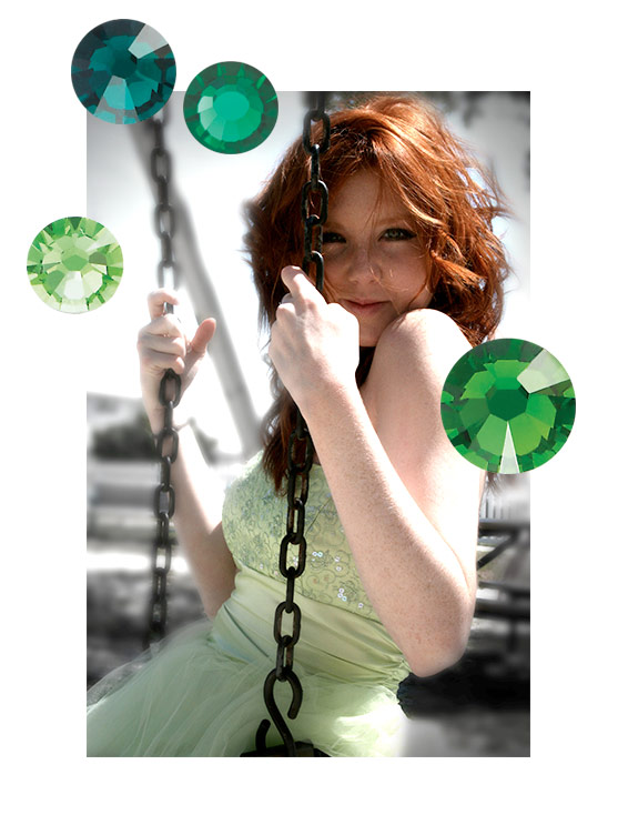
Vibrant green may seem an unusual choice to be the next big thing. But, as is the case with Pantone’s color trend forecasting, I promise you it’s already everywhere, and you’ll be drawn to it very soon. Emerald-toned items have already tiptoed into our subconscious; they’ll be dancing around you in full force by April, hailing your praises- especially you, redheads. You know green looks great on you. Wondering how to work in into your life this year? It’s easier than you may think.
1. Pair it with last year’s tangerine purchases. The exultant flame orange of late is still a relevant pick-me-up in our closets, and folks seem to be jonesing for brights this season. Shades of red work well with green. Why? Because of their respective positions on the color wheel, the primary color red is directly opposite the secondary color green. When those opposites –referred to as complementary colors- are placed side by side, each shade is intensified. Ultimately, it brings out the best in both, and creates a dynamic duo. This effect of complementary colors also extends to the tertiary shades directly next to the main combination: red-violet and red-orange also work with green (note my redhead comment, above).
Try your orange tights underneath an Emerald shift dress for a nod to 60’s Mod, or put a coral-colored necklace on top of a green silk blouse. Think of Stravinsky’s Firebird let loose in a lush garden of deep greens- the environment comes alive with energy merely by the presence of the fiery phoenix.
Here’s my tip: To avoid visual competition, keep the ratio below 3:1. When there’s near-equal parts of red and green, your eye doesn’t know where to settle, so establish your main color and add its compliment only as an accent.
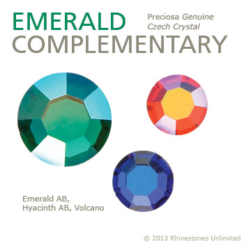
Check out these complementary rhinestone combinations:
Preciosa Genuine Czech Crystal - Emerald AB, Hyacinth AB and Volcano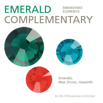
SWAROVSKI ELEMENTS - Emerald, Blue Zircon, Hyacinth
2. Set the tone with a multifaceted monochromatic. The key in single shade statements is to stay away from a single shade. Confused (and/or tongue-tied)? Remember the classic 50’s trend of 3-piece sets in the same fabric? Skirt, shell and sweater plus matching shoes and handbags equals one big, boring blob. Add dimension and interest by blending shades of the same color family.
Think of interior decorating, here. A room painted floor to ceiling in the exact same color feels like a confined box, no matter the size. But when they stipple a second layer in a slightly warmer tint over the north and east walls, lighten the ceiling by two shades, and lay down a patterned rug, it’s infinitely more livable, and still keeps the intended mood.
Layer emerald in triplicate with its lighter and darker versions, like highlights and lowlights. I promise you your finished look will be a much more interesting monochromatic than just the single shade.
Here’s my tip: Life in mono also works when you interject varying textures and finishes. If you’re set on an all-black piece, for instance, work in a matte next to a glossy, or consider the effects of a tone-on-tone jacquard broken up by a solid, smooth silk.
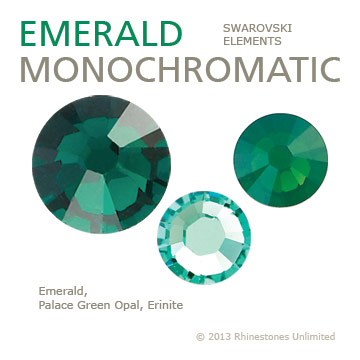
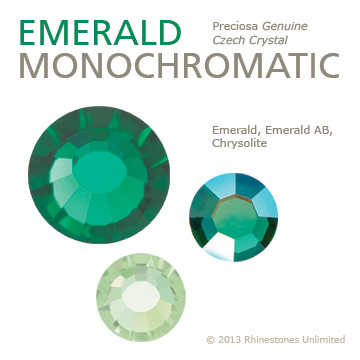
Check out these monochromatic rhinestone combinations:
SWAROVSKI ELEMENTS - Emerald, Pacific Opal, and Erinite
Preciosa Genuine Czech Crystal - Emerald, Emerald AB and Chrysolite
3. Sandwich Emerald in between turquoise and chartreuse. Tertiary colors on the color wheel refer to the shades that are immediately next to a certain hue. In green’s sake, that means yellow and blue. The shades that surround a color give a very harmonious look when used together. It’s effortless: the colors look beautiful together, as they’ve been drawn from the same gene pool, if you will. But, they offer enough variety with the warm hues on one side and cool hues on the other that each color still holds its own distinct personality within the unified group. Your brain almost wonders in which direction green will choose to go…
Here’s my tip: Give the suggestion of a chosen path by combining at least 3 parts of the main shade to 2 parts of the second and only 1 part of the third. Here again, we’re adding a bit of imbalance in to order to direct the eye to move throughout the entire piece.
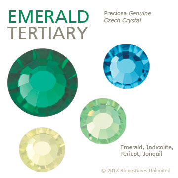
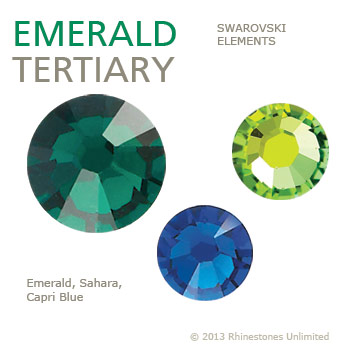
Check out these tertiary rhinestone combinations:
Preciosa Genuine Czech Crystal- Emerald, Indicolite, Peridot, and Jonquil
SWAROVSKI ELEMENTS - Emerald, Sahar, and Capri Blue
4. Let green shine, vibrant and fresh, in all its glory on a neutral background: Black, white, various shades of nude or brown. Though they’re referred to as “neutrals,” each pick will yield different statements. Brown with Emerald is immediately earthy, reminding us of expanses of evergreen forest. Emerald with white is an eye-popping contrast, and tucking it into black gives it a sultry mysterious vibe. My preference for a tidy and modern look is to frame Emerald with slightly cool medium gray or charcoal. With such an intense color, you want to make sure your neutral has enough oomph in it to vie with the main event. If, for instance you’re doing a pale wash of green, a pure black would overpower the shade; likewise, a saturated Emerald would all but obliterate a wispy fog gray, and have little background to stand against. Play with the strength of your neutrals to find a balance that supports the focal color.
Here’s my tip: Though often used as simply an accent, don’t forget that metallic can be very effective as a backdrop for your color when used in large amounts. Add bits of a third element to squelch any clichéd couplings (my mind immediately pictures a leprechaun when I’m trying to consider green with gold…)
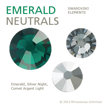
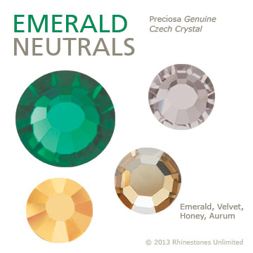
Check out these neutral rhinestone combinations:
SWAROVSKI ELEMENTS - Emerald, Silver Night and Comet Argent Light
Preciosa Genuine Czech Crystal - Emerald, Velvet, Honey and Aurum
So, skip your way through to December, keep your eye out for the greens that will abound, and I encourage you to see what green can do for you. You can start small- a printed wallet, an enamel bracelet, a manicure, a necktie, a beautiful handmade card. Even if green is not your thing, and Emerald doesn’t take, don’t sweat it. Just put it into your consciousness, accept it for the beautiful color it can be, and leave it there.
When you begin 2014 and discover Pantone’s next pick off the palette, maybe you’ll have discovered the role that the shades have played in your creative brain. In the meantime, I leave you with some other things that are awesome, and fall in that space on the color wheel between yellow and blue: Alluring lady M&Ms! Mint chip ice cream! The Luck of the Irish! Bottles of Heineken! Spring! Minnesotans, you hear me? Spring!! The vitamin-packed source of Popeye’s strength! Grassy knolls and verdant pastures! The hills that are alive with the sound of music! Some lagoons! The Grinch, after his heart grew! …Wait…yeah! Your favorite nostalgic punk-rock hairdo! Broccoli stuck in the teeth of your man’s gorgeous ex! Minty fresh breath! Catnip! ...
-xo-
Jemm
Rhinestones Unlimited blog author Jemm Stone is a multifaceted girl navigating our sparkly world with on-point insights. Visit RhinestonesU.com/blog to follow her thoughts as she highlights design trends, turns the spotlight on industry influencers and breaks down how-to tips like light through a crystal prism. P.S. For more on Pantone, their elected Colors of the Years past, seasonal palettes and rhinestone equivalents, check out the Rhinestones Unlimited blog articles tagged “Rhinestone Colors,” including 2012’s Color of the Year articles, below: The Results Are In: A Punchy Palette for Fall 2012 published 11/1/2012 Hot Rhinestone Colors for Fall/Winter 2012 Trends published 11/1/2012

 Bulk
Bulk Crystal
 Crystals
  Sales &