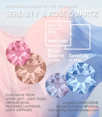
Pantone Color of the Year 2016: It's Twins!
Posted by Rhinestones Unlimited on Jan 7th 2016
For the first time in Pantone’s history, the color company announced two shades for the title of “Color of the Year 2016”: Rose Quartz is a soft warm pink, balancing the misty baby blue of Serenity. Announced on December 3rd, the color pairing is said to represent the “global mood” of consumers worldwide over the next twelve months.
“What is the Pantone Color of the Year? A symbolic color selection; a color snapshot of what we see taking place in our culture that serves as an expression of a mood and an attitude.” –From Pantone.com
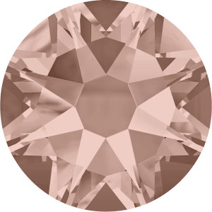 | 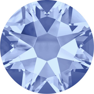 | |
| ROSE QUARTZ: Vintage Rose | SERENITY: Light Sapphire |
It’s up for debate in my book whether people start fervently buying products in these colors because their tastes really were moving toward them, or because Pantone has reported that their tastes were moving toward them. Either way, the group of experts that gathers in extreme secrecy every year has analyzed thousands of cultural trends to identify a single color—or, in this case, two colors—that resonate with the masses.
“[Consumers] seek mindfulness and well-being as an antidote to modern day stresses…the pairing of Rose Quartz and Serenity brings calm and relaxation.” -From Pantone.comThese soft shades are riding the heels of Marsala, the muted blush wine named Color of the Year 2015 which, in retrospect, can now be seen as a gentle transition away from the vibrant shades of the past few years: Radiant Orchid in 2014, Emerald in 2013 and Tangerine Tango in 2012.
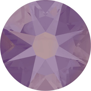 | 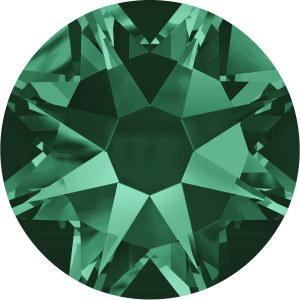 | 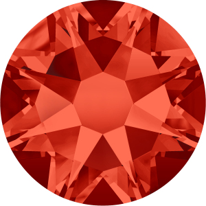 | ||
| RADIANT ORCHID: Cyclamen Opal | EMERALD: Emerald | TANGERINE TANGO: Hyacinth |
Get ready to see interpretations of Rose Quartz and Serenity in every sect of the modern marketplace: interior paints, graphic posters, start-up company logos, home collections, eyeshadows, lingerie, designer fashion and accessories of every shape and size. My favorite way to introduce a new color—especially one that I wouldn’t consider part of my usual closet palette, i.e. rose and/or periwinkle—is on my nails. It’s a $5 investment and a week-long commitment. (Maybe add some crystals on top! Swarovski Antique Pink and Light Sapphire are the perfect shades for a monochromatic manicure with some extra self-pampering sparkle.) And, since our hands are almost always in front of us, so therefore is the color always before our eyes. What may first be surprising to our attention at least gives us a boost of energy; and, after a bit, the shade against our skin begins to look perfectly natural. And if you find, in fact, it doesn’t, don’t stress. Celebrate the fact that change is a series of baby steps, and every time we practice stepping out of our element, we grow. Our perspective gets a little wider, our compassion a little deeper, our wisdom a little clearer.So, whether or not Rose Quartz and Serenity are for you in 2016, just relax; slow down, take it all in. The invitation to try a new shade on for size is an opportunity to break from our routine and find a way to live life on a broader spectrum. SERENITY NOW!!!*-xo-
Jemm
Rhinestones Unlimited blog author Jemm Stone is a multifaceted girl navigating our sparkly world with on-point insights. Visit RhinestonesU.com/blog to follow her thoughts as she highlights design trends, turns the spotlight on industry influencers and breaks down how-to tips like light through a crystal prism. For more on Pantone and the Color of the Year, visit the Pantone web site.
P.S. A fashion tip from an industry-trained but non-active follower: You may want to set aside your bold graphic accessories in 2016. They can hold their own with oversaturated, tech-centric colors, but the volume and visual weight of these pieces can overpower airy pastels. Instead, reach for romantic accessories, which are a harmonious complement to pastel fashions. This doesn’t have to mean sickly-sweet old fashioned romance; themes can be cleanly modern, too. Watch for an increase of floral, filigree, chiffons, scallops, wire wrapped stones and delicate gold chains, patinas and lots of organic curves.
*I couldn’t resist the Seinfeld reference. Visit our shopping site at RhinestonesU.com for the crystals shown in the following color pairings. Images are from the Swarovski 2088
product line.
Monochromatic color schemes use variations of the same main color- maybe with different light to dark values or adding a slight tint to subtly change the base color.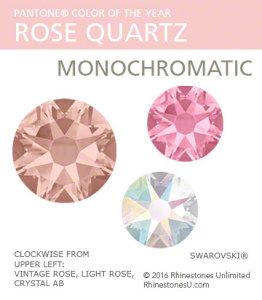 | 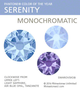 | 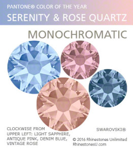 |
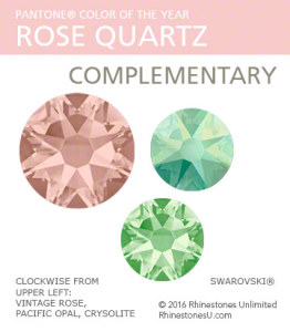
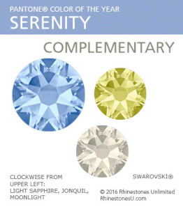
Complementary colors are directly opposite each other on the color wheel, for example red and green. When mixed, as with paint, you get a shade of brown; but when used side by side, each color becomes more vibrant.
 |  |
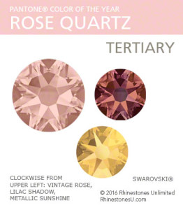
Tertiary color schemes use three shades that sit next to each other on the color wheel, for example green, blue and violet.
 | 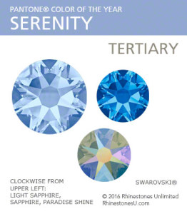 |
Neutral colors, the "safe" colors, provide a quiet background for the main color to shine. Neutrals include black, white, greys and browns. Though traditionally safe, each neutral is distinctly different; play with different neutrals, and see how the mood of your color scheme changes.
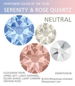

 Bulk
Bulk Crystal
 Crystals
  Sales &