Swarovski New Colors Fall/Winter 2014-15
Posted by Rhinestones Unlimited on Sep 4th 2013
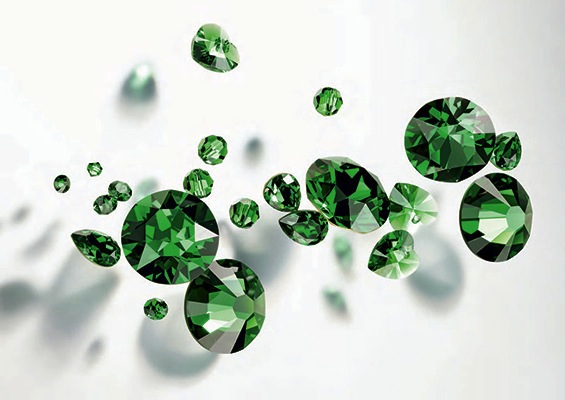
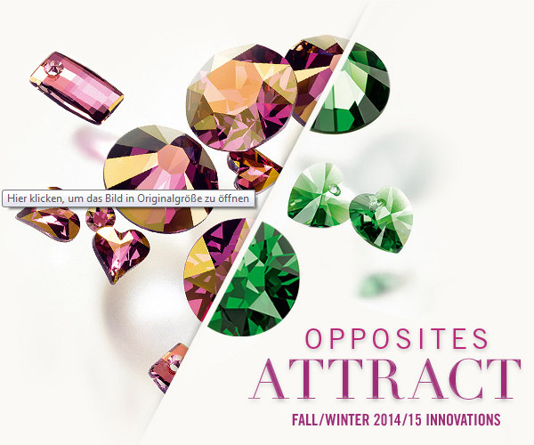
After careful consideration, Swarovski has released two beautiful new crystal shades, predicting hot colors of future seasons, and manufacturing has begun! Available now, designers of all genres have time to plan and complete their Fall/Winter 2014-15 collections with the new crystal colors: Dark Moss Green and Crystal Lilac Shadow.
Color trends don’t just appear. They’re the product of careful study, a collection of influence and optimism from cultures across the globe. What color are people craving? How does a shade affect how an individual feels in this place or at that time? The interpretation of consumer’s moods is taken very seriously, and the resulting hues that pop out of the think tank are quick to be grabbed. This process is called color forecasting, and the result is the color manifestation of Happy, shared across the globe. Uniting the world with color? That's a pretty big deal. Looking ahead a year into the future, what colors will make us happy?
Dark Moss Green (Standard Color)
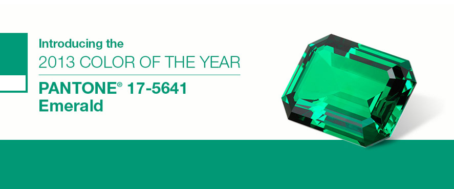
“Mimicking the most precious material nature offers, genuine gemstones, Dark Moss Green is a must for current ecology-aware trends, lending a touch of luxury.” -Swarovski Elements If you’ve been following color forecasting from Pantone- the world leader in color research and standardization- or have been out shopping anywhere this year, you’ll have likely noticed the official Color of 2013, Emerald, a bright jewel green with a slight blue tinge, has indeed graced design in all forms. (See my post-script if you're not familiar with Pantone.)
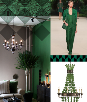
From interior paints and furniture to beauty in eyes and nails, silks, satchels, shoes and every fashion in between, our need for green has not waned. The reasoning behind choosing such a shade to reflect the global mood is apparently still relevant in the near future, in Swarovski’s eyes. And with good reason- read Pantone’s statements on Emerald as 2013 Color of the Year:
"Lively. Radiant. Lush… A color of elegance…” “ A luminous, magnificent hue, the color of beauty, new life and prosperity.” “The 2012 Color of the Year, PANTONE 17-1463 Tangerine Tango, a spirited, reddish orange, provided the energy boost we needed to recharge and move forward. [PANTONE 17-5641] Emerald, a vivid, verdant green, enhances our sense of well-being further by inspiring insight, as well as promoting balance and harmony.”
Interior and Fashion industries influenced by the rich greens
Although Swarovski has had the crystal shade Emerald (Standard Color) as part of its original line, mimicking the family of precious and semi-precious gems, the importance of green in our lives is undervalued, and needed to be stressed.
Let me give you a little example, pulled from my life. I grew up in Minnesota, the only state in the U.S. with four biomes: Deciduous Forest, Coniferous Forest, Prairie Grassland and Tallgrass Aspen Parkland. I’ve lived elsewhere happily, and I’ve traveled elsewhere happily. I’ve called home to farmland as well as one of the largest cities in the world; seen mountains, oceans, concrete jungles, flat land as far as the eye can see. One particular trip brought me to a European-inspired metropolis in one of the largest countries in South America. The sea of people on the trains and sidewalks at rush hour reminded me of the tightly knit New York City blocks, although the buildings were more ornate. Dwellings on top of shops on top of narrow walkways which dogs used to relieve themselves (and owners casually ignored the present they left in the middle of the footpath…apparently they never felt like walking all the way to the next park), gray miles of stone and cement architecture surrounded you. I spent only a week there, and a good week at that- the food, music and dance culture was amazing and crazy cheap. But, back in the Midwest, pulling up in front of my own home, my heart leapt at the sight of my verdant lawn. Until I realized what the South American city lacked- green and growing things- I didn’t know what was holding me back from embracing the lifestyle I had just left. I took off my shoes and rolled around in the grass. Not really joking. Dark Moss Green is a richly saturated version of this feeling with a slightly earthy infusion.
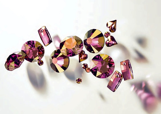
Crystal Lilac Shadow (Crystal Coated Color)
“A deep purple with an exciting hint of gold – a standout shade unique to Swarovski – Crystal Lilac Shadow both enriches and gives an air of mystery to any design.” -Swarovski Elements No preaching here- this color is just pretty. Pretty with a presence of excitement.
Those special effects colors (aka Crystal- and Color-Coated Colors) are definitely a stone you will want to see in person, as different angles play on the different tones within the crystal. Though the name Lilac Shadow suggests a warm pastel purple, this stone has a blazing undertone of vibrant fuchsia and is veiled by a wash of sun-drenched gold.
I wholeheartedly agree with the air of mystery in Crystal Lilac Shadow- for me, it calls to mind wandering cobblestone streets on a balmy night, midnight on the horizon- but the night is still young by the young’s standards and there’s life and energy around you. You’re in no rush, you’re in good company and if you keep your eyes carefully on the details, every block will give a new discovery, every door a new story. This is the color of anticipation.
Request a sample stone to explore these shades for yourself, as every eye sees something different. Color sample cards including these new shades will be available for purchase this October 2013. Updated every year, our Swarovski color sample cards feature an actual 20ss sample flat back stone in every available color. Stones are attached to a clear sheet that lifts to accept your material underneath. See all of our color sample cards here: http://www.rhinestonesu.com/rhinestone-color-sample-cards.aspx
Check back soon for my suggestions on color pairings using the new Dark Moss Green and Crystal Lilac Shadow- there will be pictures!
-xo-
Jemm
Rhinestones Unlimited blog author Jemm Stone is a multifaceted girl navigating our sparkly world with on-point insights. Visit RhinestonesU.com/blog to follow her thoughts as she highlights design trends, turns the spotlight on industry influencers and breaks down how-to tips like light through a crystal prism.
PS- About the PANTONE Color of the Year "The Color of the Year selection is a very thoughtful process. To arrive at the selection, Pantone quite literally combs the world looking for color influences. This can include the entertainment industry and films that are in production, traveling art collections, hot new artists, popular travel destinations and other socio-economic conditions.
Influences may also stem from technology, availability of new textures and effects that impact color, and even upcoming sports events that capture worldwide attention. For more than a decade, Pantone’s Color of the Year has influenced product development and purchasing decisions in multiple industries, including fashion, home and industrial design, as well as product packaging and graphic design." See the past colors at the Pantone website: http://www.pantone.com/

 Bulk
Bulk Crystal
 Crystals
  Sales &