Swarovski New Colors for Spring/Summer 2014
Posted by Rhinestones Unlimited on Jul 18th 2013
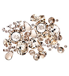
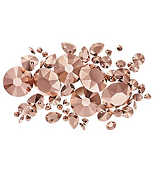
Have you seen these? Take a closer look at the two new fresh and beautiful Swarovski crystal colors: Light Silk and Crystal Rose Gold, available now in preparation for next year’s forecasted trends. The inspiration behind Swarovski’s Spring/Summer 2014 line was all Woman: a celebration of femininity, of power, of mystery.
The color manifestation of such a divine creature has turned out to be warm and subtle tints of blush, layered in nuances. As I am wont to preach, color is a personal experience, different for each beholder’s eye. Swarovski’s official statements on the new additions may be just the explanation you need to grasp the essence of the effects; but if not, I also give my two cents- this time in the form of a PG-rated fantasy situation.
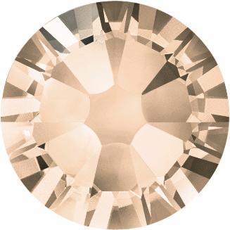
Light Silk (Standard Color)
Says Swarovski: “Both timeless and versatile…” “Light Silk is, as its name suggests, like silk in crystalline form- a classic, sophisticated shade that beautifully complements the existing color palette, which can also be used to form timeless, natural looks that exude understated elegance. Light Silk can be used as a main color to make elegant designs sparkle, but it is also an ideal nuance in powerful combinations and tone-on-tone pastel creations to provide accents of refined splendor and can easily be combined with classic and on-trend shades alike.”
Says Jemm: “Light Silk makes me feel like I’ve plunged into a 007 film, drinking a flute of champagne in a dress with a plunging V neckline, shoulders bare, a sheen over my skin, the wispy folds of the train lingering in my wake for the briefest of moments as I move through the room. I’m confident, composed, perhaps a bit disinterested. My mannerisms are graceful and subtle. But my eyes…they give me away, flashing a secret that he catches from across the room…”
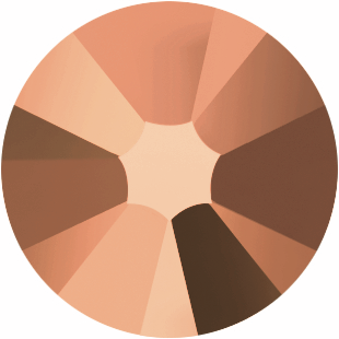
Crystal Rose Gold (Coated Color)
Says Swarovski: “… A final coating of 18-carat rose gold creates a trendy, feminine look in which all that glitters is gold.” “The new Crystal Rose Gold effect, a luxurious blend of precision-cut crystal and precious metal, glimmers with an 18-carat rose-gold finish offering a delicate golden hue with a softly muted pink tinge. Crystal Rose Gold is an unprecedented effect that will provide completely new combination and design possibilities, especially in the Jewelry and Accessories segments, and brings together the beauty of crystal and the refinement of precious metal.”
Says Jemm: “What other color can feel simultaneously earthy and opulent? Crystal Rose Gold is the equivalent of the late afternoon on a balmy spring day; having abandoned your responsibilities and cast their memory behind you, 300 miles away, you pull off the road, remove a layer, luxuriate in a stretch over the sun-warmed hood in your bare feet, aim a camera towards the horizon, where the land rises to meet the sky- all the while knowing that you’ll never be able to capture in a photo the true feeling of this moment of freedom, and beauty, and warmth: serenity.”
Let’s try another descriptive route.
Psst- Swarovski also makes a Rose Gold pearl. We have the flat back pearl #5817!
If we were thinking in terms of dessert, I might relate Light Silk to a frothy raspberry peach meringue-topped confection or a fresh lavender shortbread cookie; in terms of touch, the cool side of a satin-lined pillow on your cheek. Crystal Rose Gold could be similarly dubbed a vanilla caramel softened over a crisp chocolate wafer of the thinnest proportions- but only the first bite. The Crystal Rose Gold sense of touch is that really pure, dense, mousse-smooth mud you sink your hands into before spreading it around your skin with your fingertips.
Both of these shades, by the way, look great against bare skin, bringing out a glowing flush in any tone (they are nudes, after all). They are understated but indulgent, enthralling and- just like a woman- totally alluring. Damn. They nailed it. See for yourself why Swarovski’s Light Silk and Crystal Rose Gold effects can command so much attention. Ask us for a sample stone to add to your color chart, or be bold and order a full package on your good instincts.
-xo-
Jemm
Rhinestones Unlimited blog author Jemm Stone is a multifaceted girl navigating our sparkly world with on-point insights. Visit RhinestonesU.com/blog to follow her thoughts as she highlights design trends, turns the spotlight on industry influencers and breaks down how-to tips like light through a crystal prism. PS- Wondering how to work these new colors into future projects?
As both Light Silk and Crystal Rose Gold are nude shades (despite Rose Gold’s metallic element), treat them as such in your color pairings.
Light Silk, a pale color, works well with other pastels and muted tones -Light Peach, Provence Lavender, White Opal and Antique Pink are pleasing choices (Ironically, I wouldn’t bother mixing it with Silk. The color differentiation is too subtle for either to shine as an individual when placed next to each other). It also looks really sexy next to a deep metallic, like Dorado or Jetnut, and it amps up the warm sultry darks of Mocca, Burgundy, even Dark Siam.
Crystal Rose Gold is a little different, in my opinion. This is a stand out crystal that will make the biggest statement when it’s en masse with itself. It’s a rich shade, despite its delicate tint. Don’t get me wrong- it will compliment other color designs: Vintage Rose, Moonlight, Greige, Jet Hematite, Silk. It can work nicely with stones that don’t try to compete with it, colors with warm undertones that can keep a low profile.
But- and again, this is just my opinion- when Rose Gold is featured as the main design element, it will come into its own. This stone is coated in gold, for heaven’s sake- GOLD. Give it the spotlight, and you won’t be sorry. We’d love to hear your thoughts on these new colors: descriptive sensory words, your first impressions, how you incorporate them into your projects, we want to know! What is your experience with Swarovski’s Spring/Summer 2014 shades? Email reception@rhinestonesunlimited.com with the subject line “My Color Experience Spring/Summer 2014.”

 Bulk
Bulk Crystal
 Crystals
  Sales &