Swarovski New Colors for Spring/Summer 2017 Trends, part 2
Posted by Rhinestones Unlimited on Mar 22nd 2016
Ah, new colors. I love this time of year…these posts let me get truly ridiculous. And, you keep reading! (Sucker.) Ahhhhh, dear reader. I’m truly thankful for you. Ok, so, let’s get on with it. Yellow Opal. Somehow, I like this better than Citrine. Literally, it looks like a tasty lemon drop, a creamier version of Citrine, but emotionally, it’s just more sophisticated than the classic transparent yellow. Maybe it’s just because it’s new. Liken it to centuries of jewel lovers comparing the ultra-clarity of their canary diamond, and then one day someone appears in society’s haughty circles with a raw canary diamond, leaving everyone lusting after the nuances of opacity. The opalescence trapped inside of Yellow Opal makes the sunny shade more approachable- I think because it allows grown adults to enjoy a color that’s more often relegated to children’s toys. Just think of Yellow Opal as the raw, organic version of crystal Citrine. So hot right now. Graphite. A dark grey. Sexy. Understated. I’m drawn to moodier, muted tones, but if you take my bias out, you can still come to similar conclusions with basic color/mood associations:
Dark = mysterious Black = strong Neutral = masculine or feminine appeal
This particular crystal color has a hint of blue when you see it, similar to a Swarovski Montana shade, which manifests most visibly deep in the center of the stone. But, you almost have to take a second look to see the blue. What it comes down to is that basically, Graphite can hold your gaze. We call that “mesmerizing.” Sexy, no? Understated, no? [caption id="attachment_1797" align="alignleft" width="160"]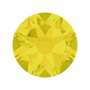
Swarovski Xirius #2088 in Yellow Opal
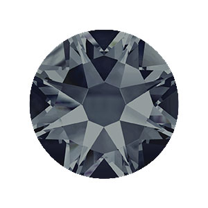
Swarovski Xirius #2088 in Graphite
Combinations of grey and yellow are a hit the last couple seasons (just look at any furniture and home goods site). Individually, they’re both contradictions within themselves: both warm reminders of nurturing nature, and also of the cold technological age of machines. Everyone knows that grey is easy to work with, but the easy appeal of Yellow Opal in your combinations may surprise you… So. Assuming you don’t have a sample of these new crystal colors in front of you, and you have to depend on my words and computer images, allow me to, once again, regale you with my sensory interpretations of these shades.
Yellow Opal, as interpreted by Jemm Stone. We’ve already established that it looks like a tasty lemon drop. If it were a smell, it would be the warm, mouthwatering scent of a lemon custard tart baking in the oven. It would sound like a cheery robin’s spring song. It would feel like the smooth mouthfeel of distilled, overpriced, bottled glacier water at room temperature sliding over your tongue. It would taste like…I can’t help it…a tasty lemon drop. YUM!
Graphite, as interpreted by Jemm Stone. If it didn’t look like Graphite (the crystal) or graphite (the carbon material), Graphite would look like a crisply tailored silk shantung suit. It would smell like a fresh, oceanic androgynous cologne; it would sound like a resounding canyon echo; it would feel like stretching out on a sun-warmed rock after a brisk hike in the cool green woods; it would taste like a grill-charred slice of marinated chicken breast. YUM!
Have I lost you in my melodramatic abstractness? Eh. C’est la vie. Maybe you should just see the colors for yourself. They're in stock now and these new shades will be added to the Swarovski Color Sample Card series this fall. Then, you can play around with your own sensory journeys and crystal color experiments. But, until then, I leave you with my color pairing suggestions, below.
-xo- Jemm
Rhinestones Unlimited blog author Jemm Stone is a multifaceted girl navigating our sparkly world with on-point insights. Visit Blog.RhinestonesU.com to follow her thoughts as she highlights design trends, turns the spotlight on industry influencers and breaks down how-to tips like light through a crystal prism.
Monochromatic color themes use variances of the same color. 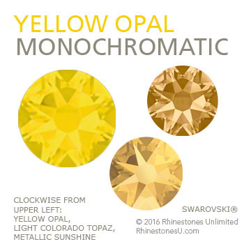
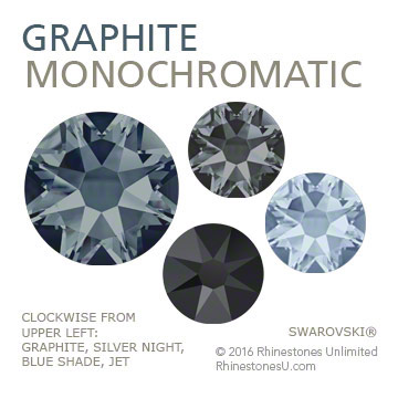 Complementary color themes use the two colors that are opposite each other on the color wheel.
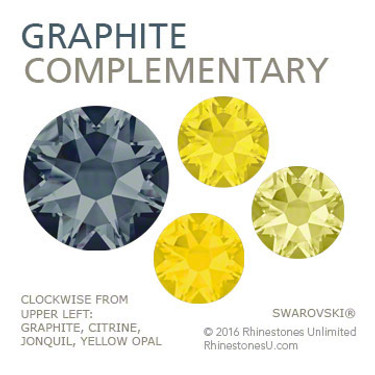
The contrast brightens both. (In Graphite's case, I took the opposite of its blue undertone.) AFTER PUBLICATION CORRECTION: A devoted reader pointed out that purple is actually the complementary opposite of yellow, and orange of blue! I must have been so dazzled by the vibrant, pure color of Yellow Opal that I reverted back to my childhood favorite color pairing of yellow and blue. Ah, well- they still look so good together, don't they? See the actual Complementary pairings here.
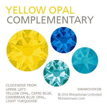
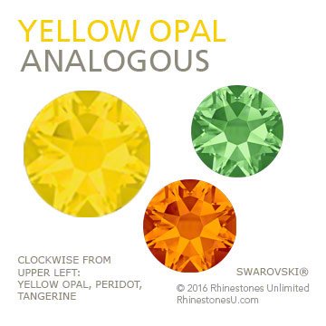
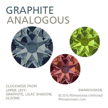
 Analogous color themes combine neighboring colors on the color wheel.
(In Graphite's case, I took the neighbors of its blue undertone.)
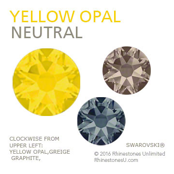
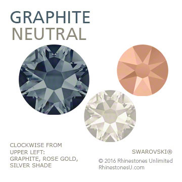
 Neutrals are the safe colors, those not on the standard color wheel: blacks, greys, whites, nudes, browns. I often include metallics as a neutral, as well. Neutrals generally create an unobtrusive background for the focus color to jump out from.

 Bulk
Bulk Crystal
 Crystals
  Sales &