"The Art of Coloring Your Life"
Posted by Rhinestones Unlimited on Mar 30th 2015
Heh, heh. I hate to say, "I told you so," but, I told you so.
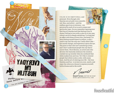
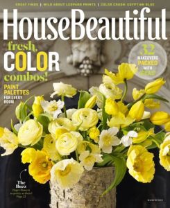
While lounging in the bath, sipping on a melted concoction of Bailey's and vanilla ice cream and flipping through the March issue of House Beautiful- an issue bursting with color- I ran across wise words (surrounded by a collage of paper tidbits) in the letter from the editor- words that I've been preaching for the last three years in my own color articles:  Your perspective- yours, dear reader- is unique in the world. It's one in seven billion. It's even more unique in the time it took me to type that sentence, as the world population meter rises every millisecond (I'm watching it on worldometers.com). What you see, hear, feel, smell, taste, sense- the information that your body brings to your brain is edited and processed unlike any other body or brain. I mean, even the two eyeballs in your own face don't see the same thing! Ever play that winking eye game to yourself? You know, the one where objects in your view jump back and forth between left eye and right eye? My point is, you can't rely on someone else's eyeballs to tell you if coral is pink or orange or red or peach, or how you'll feel when you see it.
Color is your own emotional, personal experience. Let's enjoy it! Color is fun! Color is pleasurable. Yes. And why deny yourself pleasure, dear reader? Are you sensing my change of undertone? Now, shoo, shoo. Go experiment. Who knows; you might even find something you like.
-xo-
Jemm
Rhinestones Unlimited blog author Jemm Stone is a multifaceted girl navigating our sparkly world with on-point insights. Visit RhinestonesU.com/blog to follow her thoughts as she highlights design trends, turns the spotlight on industry influencers and breaks down how-to tips like light through a crystal prism. P.S. Rather than relying on a friend's eye or a computer monitor with adjustable screen settings, let us send you a sample of a few colors you're debating against for your project. Or, better yet, invest in one of our sample cards, each of which has a brand's full color selection represented in real stones on a transparent sheet. P.P.S. Wondering why the magazine page has a sticker that says, “EVERYDAY I’M HUSTLIN,” backwards? Well, I’m still wondering that, too. But some of your collage questions can be answered on the House Beautiful website: https://www.housebeautiful.com/design-inspiration/a3383/march-2015-ed-letter/

 Bulk
Bulk Crystal
 Crystals
  Sales &
