Whoops, Fail!
Posted by Rhinestones Unlimited on Apr 13th 2016
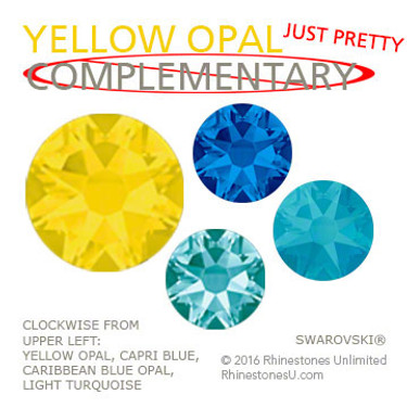
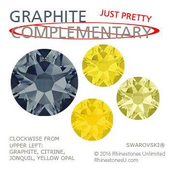
Haha! Dear reader, I totally biffed the color pairing suggestion in last month's article, "Swarovski New Colors for Spring/Summer 2017 Trends, part 2":
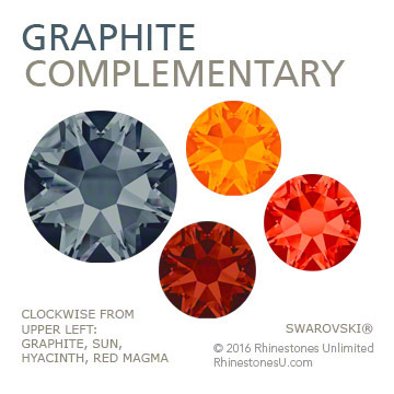
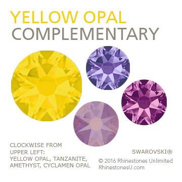
In actuality, PURPLE is the complementary opposite of Yellow, and Blue’s complement is ORANGE, and thanks to a devoted reader for catching my error. What was I doing? But, thankfully, blue and yellow make a very attractive combination (my favorite, in fact, when I was growing up, and so my bedroom was decorated around the theme) so, c’est la vie. Here's an actual complementary pairing suggestion- for real, this time- for new colors Yellow Opal and Graphite, which has a very subtle blue undertone: Complementary color themes use the two colors that are opposite each other on the color wheel. The contrast brightens both. (In Graphite's case, I took the opposite of its blue undertone.)
Whoa!! That's much more vibrant. I'm SO glad I had an excuse to play with color again- these were definitely worth the efforts.
-xo- Jemm
Rhinestones Unlimited blog author Jemm Stone is a multifaceted girl navigating our sparkly world with on-point insights. Visit Blog.RhinestonesU.com to follow her thoughts as she highlights design trends, turns the spotlight on industry influencers and breaks down how-to tips like light through a crystal prism.

 Bulk
Bulk Crystal
 Crystals
  Sales &


