


Pantone Color of the Year 2017: Greenery
Posted by Rhinestones Unlimited on Mar 16th 2017

Pantone Color Institute has selected Greenery, a soft, fresh spring green, as the 2017 Color of the Year. “Greenery is nature’s neutral. The more submerged people are in modern life, the greater their innate craving to immerse themselves in the physical beauty and inherent unity of the natural world.” -Pantone.com This contrast- modern technology vs. nature- has inspired many of Pantone’s COTY’s the last few years and even Swarovski® new launch shades (which you may have noticed if you've been following this blog).
A visual cue card indicative of attitudes and trending tastes on horizons near and far, the annual Color of the Year selection resonates with consumers around the world as a “symbolic color selection; a color snapshot of what we see taking place in our global culture.” And, we’ll take it.
This year’s star, Greenery, is a color of renewal, of rejuvenation, of optimism and balance. I don’t know about you, dear reader, but it seems to me the last year has been weighted with significant events and emotions all around. Let’s call 2016 the year of growing pains.
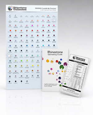
How perfect, then, for 2017 to be heralded by the color that reminds us (especially us Midwesterners!) of the hope and optimism of growth in spring. We’re headed somewhere beautiful, people! So, on that note, get out your Swarovski® Color Sample Card let’s play with some beauty right now.
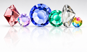
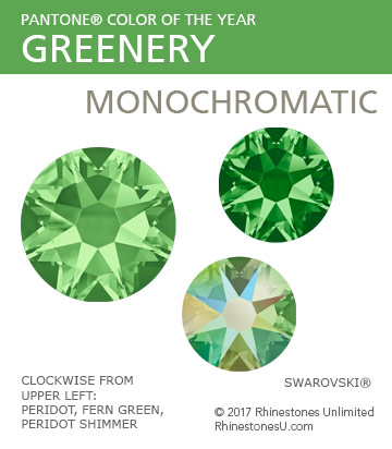
Below are some color pairing suggestions based on the color wheel featuring Swarovski® Peridot as my interpretation of Greenery; don't be afraid to explore your own color combos. Monochromatic color schemes use variations of the same main color- maybe with different light to dark values or adding a slight tint to subtly change the base color.
Analogous color schemes use three shades that sit next to each other on the color wheel, for example green, blue and violet

Complementary color schemes use direct opposites on the color wheel, for example red and green. When paired side by side, each color becomes more vibrant by contrast.

Neutral color schemes rely primarily on the “safe” colors- black, white, nudes, greys and browns- providing a quiet background for the main color to shine. Though the effect is generally mellow, each neutral is distinctly different; play with different neutrals, including metallics, and see how the mood of your color scheme changes.

For more insight from Pantone and really great color story options featuring Greenery, visit the Pantone Color of the Year 2017 page.
Rhinestones Unlimited blog author Jemm Stone is a multifaceted girl navigating our sparkly world with on-point insights. Visit our blog to follow her thoughts as she highlights design trends, turns the spotlight on industry influencers and breaks down how-to tips like light through a crystal prism.