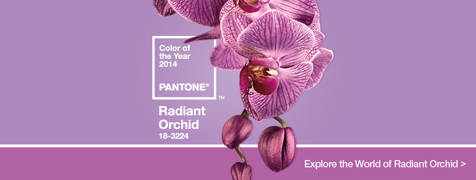
Pantone’s Color of the Year 2014: Radiant Orchid
Posted by Rhinestones Unlimited on Feb 6th 2014
If the color Radiant Orchid was a tangible object, I imagine it would be an infinity pool tucked inside a colorful garden, overlooking a calm valley. I imagine that when I stepped in and sunk to my shoulders- in the morning hour when everything is still quiet: the rush is past, the sunlight is present and what’s left is the breath that lingers in optimism for the day ahead- that the lilac-tinted liquid I am moving in (for it’s a Wonka-inspired infinity pool) tastes sweet, feels creamy and warm…
Huh. I just wrote that introduction based on my initial reaction to seeing the color for the first time on my computer, but delving further into my research, I’m seeing a lot of similar ideas coming from the mouths of the color experts themselves…either I’m a genius or the global mood (which Pantone is paid to analyze) really is as they say. I noted a lot of anticipation, mystery, intrigue, creativity associated with purples, and this rosy-cheeked medium version is flush with enthusiasm.
“Radiant Orchid blooms with confidence and magical warmth that intrigues the eye and sparks the imagination. It is an expressive, creative and embracing purple—one that draws you in with its beguiling charm. A captivating harmony of fuchsia, purple and pink undertones, Radiant Orchid emanates great joy, love and health.” “…a captivating, magical, enigmatic purple…” “An invitation to innovation, Radiant Orchid encourages expanded creativity and originality…” “Uplifting and bold without being overpowering, Radiant Orchid re-energizes almost any color palette and provides a unifying element…” “A modern and surprisingly versatile shade…” “…flattering to many hair, eye and skin tones.”
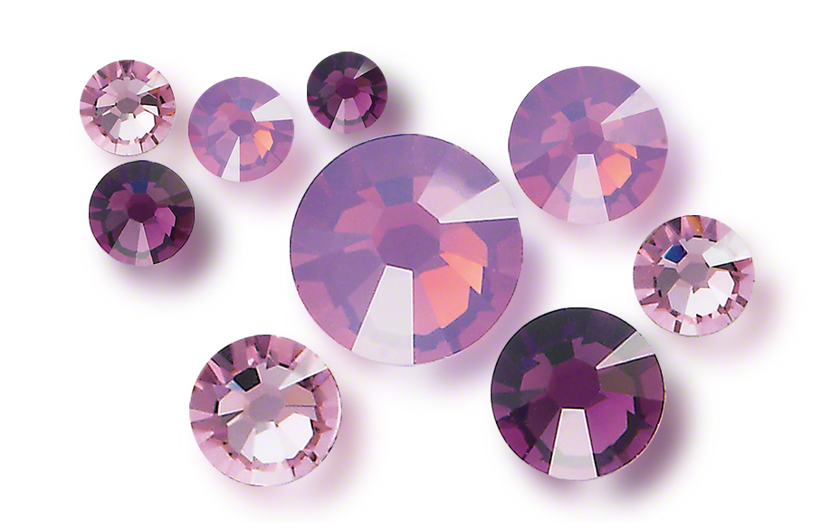
Swarovski Cyclamen Opal, Amethyst and Light Amethyst[/caption] Lots of fancy and inspiring words from the critics. The bottom line? Radiant Orchid is a welcoming and approachable color, and you’ll see a lot of it this year, so it’s worth getting to know. When Pantone appoints the Color of the Year, it’s like announcing the winner from the list of Golden Globe nominees. The contenders are shades that have made an impression all over the world, transcending cultures, ages and spaces- but the winner is the one whose dramatic display has awakened the collective heart. Then, suddenly, you see them splashed all over the magazine covers, in celebrity weddings, department stores, perfume ads, greeting cards, your living room couch... oh, wouldn’t that be something…
Pantone’s elected color of the year will appear in fashion fabrics, decorative papers, interior paints, graphic designs, product labels and more, as it has been designated by the company specializing in color as the most desired around the world- even before people realize their desire for it. This is called trend forecasting, my friend, and it is a definition of our times. Remember Harvest Gold and Avocado? No, half of you don’t. Those were the colors that reflected the tastes and interests of consumers worldwide back in the early 1970s, warm earth tones to connect back to nature following the eye-popping age of drug-induced psychedelics and overproduced synthetics.
Returning home to the 21st century, images of green carpeting and wheat-hued appliances are immediately identified as out-of-date. Bins of records, whose photos of acoustic guitars in green fields are steeped in a hazy yellow sunlight on the faded covers - you know to which era they belong. Same goes for the all-black cover with bolts of aqua and hot pink lightning in the text: awesomely 80s, baby. 90’s: crimson, sunflower yellow, and black & white gingham; the millennium: minimalist charcoals with pops of berries.
You’ll find the eras’ popular shades splashed all over movie posters, prom dresses, expensive cars- Tupperware! If there was a game called Name That Decade in which color swatches were drawn from a stack and shown around the room, I bet a majority of your drunken party guests would be shouting the same year. Why? With sight being our dominant sense, we identify with color, whether or not we’ve registered that fact in the moment.
Though recent years may still be sifting through the sieve of our subconscious, visual designs affect, represent, define our decade. It may not be obvious for another 30 years, but the colors we are living amongst today are the shades of our generation. So, start with Radiant Orchid this time, and see where it takes you.
-xo-
Jemm
Rhinestones Unlimited blog author Jemm Stone is a multifaceted girl navigating our sparkly world with on-point insights. Visit RhinestonesU.com/blog to follow her thoughts as she highlights design trends, turns the spotlight on industry influencers and breaks down how-to tips like light through a crystal prism. P.S. Read more Radiant Orchid quotes, suggestions for use and a bit about Pantone itself here: https://www.pantone.com/pages/pantone/pantone.aspx?pg=21128&ca=10

 Bulk
Bulk Crystal
 Crystals
  Sales &

