Swarovski New Colors for Spring/Summer 2016 Trends (part 2)
Posted by Rhinestones Unlimited on Mar 24th 2015
Once again, Swarovski has blessed us with a new collection of cuts, colors and textures to keep us on trend and up to date. The latest release, announced February 2, 2015, is being manufactured now in time for your Spring/Summer 2016 collections.
Earlier this month in part 1, I posted Swarovski’s descriptions about three new crystal shades: Blush Rose, Metallic Sunshine and Light Chrome. It’s always interesting to hear the descriptive words that have been approved by the company’s PR and Marketing channels and officially released into the world. You know it went through a panel of strict experts. Well, below is my own interpretation of the new crystal colors followed by color pairing suggestions. Whose words create a truer representation of this sparkling perfection?
Well, dear reader, you’ll have to decide. Game on, Swarovski. Metallic Sunshine (Crystal Coated Color) 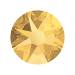
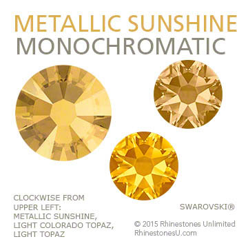
Metallic Sunshine. Writing my thoughts on this stone while perched in front of an overcast, wintery window scene, Metallic Sunshine has become my new personal savior. I have five different samples in which to gage this color- each cut with different faceting. My favorite combination, Metallic Sunshine on the new article #5515 Emerald Cut Bead*, has a large center table which now glows with the softest shade of coppery-pink, the angles around it washed in a lemony gold.
Swarovski mentions the connection of regal opulence with this new shade, and it’s easy to imagine how Metallic Sunshine would complement designs in this direction. But, to me, right now, I can’t stop dreaming about an early summer evening, when you’re driving along a road that has become invisible to your attention in the wake of routine, when the glass windows of a building off the road blaze suddenly in grapefruit and gold and coral, reflecting the setting sun. That moment of awakening, of amazement and absolute delight- that, to me, is Metallic Sunshine. * (Article #5515 is a special order item, not regularly stocked on our shelves) It’s not heavy like Aurum or Dorado. Metallic Sunshine is a sheer metallic, which adds more depth, like gazing into a reflecting pool.
In other senses, let’s compare Metallic Sunshine with an apricot-mango Cointreau margarita (taste); easing into a quiet hot tub and resting your palm on the surface of the water (touch); the tonal notes of a meditative gong or heavy wind chime undulating through the breeze (sound); and Dior J’adore. Just kidding- I don’t know what Metallic Sunshine would smell like. Maybe some perfume (no- excuse me, some eau de parfum) described as “amber musk?” Sandalwood incense? A sharp cheddar and jarlesberg grilled cheese sandwich? Yeah. All of those.
Blush Rose (Standard Color)
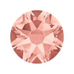
If there ever was a truly neutral shade of powdered rouge, Blush Rose would be universally flattering on cheeks worldwide. This is a denser, richer shade of Vintage Rose, touched with a few more brush strokes of color. I’m not much of a pink girl, but Blush Rose, what can I say. This stone is just pretty. Feminine, subtly sensual, muted. Oh, color is fun, isn’t it?
This new shade of pink is on par with Marsala, Pantone’s elected Color of the Year for 2015. (If you don’t know what I’m talking about, don’t fret- check out my earlier article: Color of the Year 2015). Marsala has been talked about a lot, and shares color characteristics with Blush Rose. Let’s do a speed round of descriptive ideas for this new crystal: Touch: A cashmere twinset. Sound: The steady breath of a sleeping infant. Taste: Pinot Noir sorbet. Smell: Strawberry-rhubarb pie baking in the oven
Light Chrome (Crystal Coated Color)
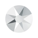
To simplify it, Light Chrome is essentially a slightly darker version of Comet Argent Light, the silvery-metallic Coated Color we all know and love. Now, Comet Argent Light is fierce on its own. So, when Swarovski describes Light Chrome as “a highly sophisticated interpretation of the color silver, which is associated with feminine energy and the moon,” all I can think is bad--s moon goddess. Part fantasy, part luxury, elegant but edgy. Swordsy. I don’t know. I imagine she would have some sort of sweet sword, this moon goddess. A dangling chain headpiece. Platinum hair. A sophisticated interpretation of the color silver breastplate. Maybe chiffon harem pants with an asymmetric train. Some sort of rad birthmark up and over her shoulder like a sleeve tattoo of a supernova. You know, a bad--s moon goddess. Light Chrome. Wouldn’t you want it on your side?
Well, frankly, these are just my sensory interpretations. Sometimes you’ll think it’s ridiculous, sometimes it’s right on and you totally get my cues. Color, like every other experience, is completely personal, and all about your own collective perspective. As I’ve said before, sight makes up 80 percent of our information intake, so don’t rely on others to describe the picture, because their thousand words may not be the story you’d see. Consider investing in a sample color chart, made with actual stones.
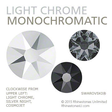
Okay. Now on to my color pairing suggestions. I’m going to use moon goddess- I mean Light Chrome- as my neutral base. These suggestions are based on the modern pigment color wheel, and though by no means the end-all, be-all of combinations, it’s fun to get your inspiration started by following the simple formulas.
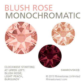
Monochromatic: Uses one color throughout, or the same base color throughout.
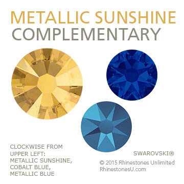
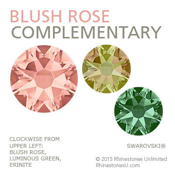
Complementary: Uses colors that are directly across from each other on the color wheel. When placed side by side, the high contrast makes each color more vibrant.
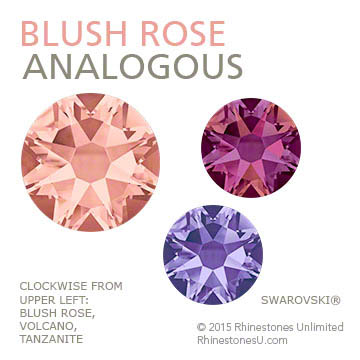
Analogous: Uses three colors that sit next to each other on the color wheel. These colors naturally get along with each other well.
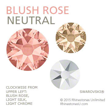
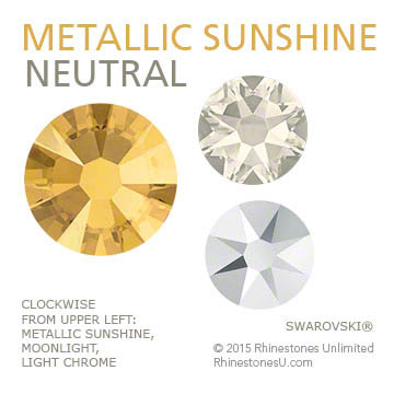
Neutral: The safe colors: gray, beige, brown, black, ivory. These don't appear on most color wheels, but make a clean backdrop for other colors to shine. I include metallics in my definition of neutral.
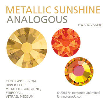
 *Note that Vitrail Medium, used in the Metallic Sunshine Analogous pairing theme, is really tricky to shoot. The flat back stone is based in a leaf green and yellow, with flashes of orange, coral and Capri Blue depending on the angle in which you view it. In the image above, the leaf green base is eluding us, though it is the reason I chose the stone for an analogous combination of orange, yellow, green.
Now, I'm going to change things up a bit for Light Chrome. As this stone is a neutral shade in itself, and thus not included on most color wheels, it gets warm and cool combos instead. 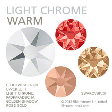
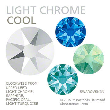 Whew! So, there you go, dear reader. Have fun exploring these new crystal shades from Swarovski, and visit the Newest Colors page of our website to see the available cuts and sizes stocked. Until next time...
-xo-
Jemm
Rhinestones Unlimited blog author Jemm Stone is a multifaceted girl navigating our sparkly world with on-point insights. Visit RhinestonesU.com/blog to follow her thoughts as she highlights design trends, turns the spotlight on industry influencers and breaks down how-to tips like light through a crystal prism.

 Bulk
Bulk Crystal
 Crystals
  Sales &
