Marsala, Color of the Year 2015
Posted by Rhinestonesu on Dec 16th 2014
And the winner is Marsala. Chosen by Pantone as the Color of the Year 2015, Marsala is a blend of blush and wine, a muted burgundy that has gone soft around the edges. It has enough pink to be inherently feminine (and flattering to all skin tones) but enough earthy brown to suit the masculine yang side. It’s vibrant enough to be a focus color, but subdued enough to act as a neutral backdrop to your corals, yellows and reds. It’s a throwback to the warm retro shades of the bohemian hippies, but is strikingly modern against a cool blue grey. Marsala is a collection of opposites that has come together in a rare combination of real appeal. 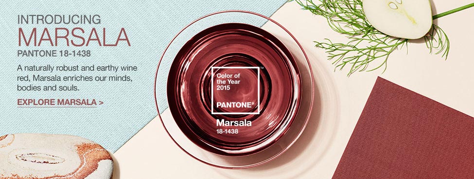 A “hearty, yet stylish tone…exuding confidence and stability. Marsala is a subtly seductive shade, one that draws us into its embracing warmth,” says Leatrice Eiseman, Executive Director of Pantone Color Institute, the company’s color forecasting team. You can find Marsala as one of Pantone’s top ten shades for Spring 2015, a somewhat surprising addition to palettes steeped in softly blurred sorbet shades, watery blues and olive greens. If you don’t know the company Pantone, it doesn’t really matter- you’re probably wearing/reading/surrounded by a product that they’ve reached. If you’re in the 21st century with a pair of working eyes, you’re taking in the colors that they have reported are representing our era. If color is a language, Pantone is your interpreter. The company was founded to create standards for color recipes in printing and dying, but has also taken on the responsibility of gathering the globe’s experts to assess and report color trends around the world. It is Pantone who looks for patterns amongst thousands of examples of art, fashion, travel, technologies, movies, current events, and tastes of generations past- a process that takes months, sometimes years. In fact, the process that identified Radiant Orchid, Pantone’s choice for 2014 Color of the Year, began at least five years ago, according to Eiseman. So, what happens next? Once the experts see the patterns, they report the shades of universal intrigue, designers incorporate those colors into anything and everything, and consumers snatch them up like trained pets. Wait a minute- who’s leading who here? It’s tough to say, really. Trend forecasting is like a cycle of call and response, but it’s too hard to pinpoint who actually started the chant. All I can say is that color is no small business. It is a language of emotion and attraction. Considering that 80-85% of information is gathered through our eyes, when it comes to moving money through an economy, visual appeal is a very big deal.
 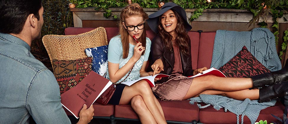 At the end of it all, a single distinct color emerges as queen and reins for 12 fleeting months before our wandering eye begins to roam. Whether or not you agree with the color choice or the process behind it, it’s fun to incorporate something new into your daily routine. Start small if you need to- nail polish is a great way to introduce a new hue, as it’s cheap and your hands are almost always in front of your eyes. Try a Marsala-shade phone case, a chunky knit blanket or go big and paint an accent wall in your dining room. Even better, get to the kitchen and indulge in a glass of great wine, which was the namesake of this year’s sophisticated color. Wondering how to recreate the look with rhinestones? According to my eye, there’s not an exact match in the current rhinestone offerings, so I’d reach for Swarovski Burgundy and Antique Pink to combine for highlights and lowlights of the shade. I suspect Marsala will be picked up quickly by all kinds of ages and personalities, but if it’s not quite right as is, choose something in the same color family. If you’re feeling a pull back to simpler times, earth tones help us feel unplugged from the neon world of technology: try the stronger brown undertone of Mocca. If Marsala is a little too dull for you, brighten up the wine red side with Red Magma or Siam. Watch for my color pairing suggestions (with pictures) in upcoming posts and be sure to visit our Pinterest page for mood boards of Marsala out and about. -xo- Jemm Rhinestones Unlimited blog author Jemm Stone is a multifaceted girl navigating our sparkly world with on-point insights. Visit Blog.RhinestonesU.com to follow her thoughts as she highlights design trends, turns the spotlight on industry influencers and breaks down how-to tips like light through a crystal prism.
 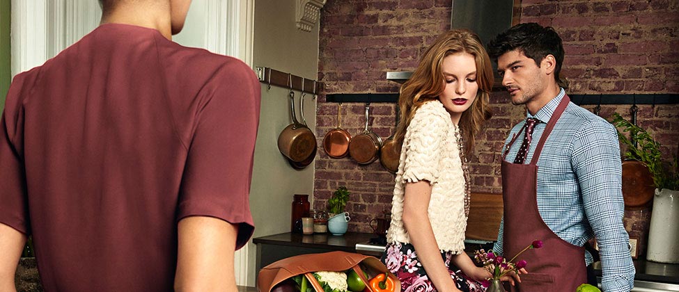 P.S. Read more about Pantone as a business and how they chose Marsala: http://pantone.com/pages/index.aspx?pg=21163 See sketches of Pantone-inspired Spring 2015 runway collections featuring Marsala: http://pantone.com/pages/fcr/?season=spring&year=2015
 A “hearty, yet stylish tone…exuding confidence and stability. Marsala is a subtly seductive shade, one that draws us into its embracing warmth,” says Leatrice Eiseman, Executive Director of Pantone Color Institute, the company’s color forecasting team. You can find Marsala as one of Pantone’s top ten shades for Spring 2015, a somewhat surprising addition to palettes steeped in softly blurred sorbet shades, watery blues and olive greens. If you don’t know the company Pantone, it doesn’t really matter- you’re probably wearing/reading/surrounded by a product that they’ve reached. If you’re in the 21st century with a pair of working eyes, you’re taking in the colors that they have reported are representing our era. If color is a language, Pantone is your interpreter. The company was founded to create standards for color recipes in printing and dying, but has also taken on the responsibility of gathering the globe’s experts to assess and report color trends around the world. It is Pantone who looks for patterns amongst thousands of examples of art, fashion, travel, technologies, movies, current events, and tastes of generations past- a process that takes months, sometimes years. In fact, the process that identified Radiant Orchid, Pantone’s choice for 2014 Color of the Year, began at least five years ago, according to Eiseman. So, what happens next? Once the experts see the patterns, they report the shades of universal intrigue, designers incorporate those colors into anything and everything, and consumers snatch them up like trained pets. Wait a minute- who’s leading who here? It’s tough to say, really. Trend forecasting is like a cycle of call and response, but it’s too hard to pinpoint who actually started the chant. All I can say is that color is no small business. It is a language of emotion and attraction. Considering that 80-85% of information is gathered through our eyes, when it comes to moving money through an economy, visual appeal is a very big deal.
  At the end of it all, a single distinct color emerges as queen and reins for 12 fleeting months before our wandering eye begins to roam. Whether or not you agree with the color choice or the process behind it, it’s fun to incorporate something new into your daily routine. Start small if you need to- nail polish is a great way to introduce a new hue, as it’s cheap and your hands are almost always in front of your eyes. Try a Marsala-shade phone case, a chunky knit blanket or go big and paint an accent wall in your dining room. Even better, get to the kitchen and indulge in a glass of great wine, which was the namesake of this year’s sophisticated color. Wondering how to recreate the look with rhinestones? According to my eye, there’s not an exact match in the current rhinestone offerings, so I’d reach for Swarovski Burgundy and Antique Pink to combine for highlights and lowlights of the shade. I suspect Marsala will be picked up quickly by all kinds of ages and personalities, but if it’s not quite right as is, choose something in the same color family. If you’re feeling a pull back to simpler times, earth tones help us feel unplugged from the neon world of technology: try the stronger brown undertone of Mocca. If Marsala is a little too dull for you, brighten up the wine red side with Red Magma or Siam. Watch for my color pairing suggestions (with pictures) in upcoming posts and be sure to visit our Pinterest page for mood boards of Marsala out and about. -xo- Jemm Rhinestones Unlimited blog author Jemm Stone is a multifaceted girl navigating our sparkly world with on-point insights. Visit Blog.RhinestonesU.com to follow her thoughts as she highlights design trends, turns the spotlight on industry influencers and breaks down how-to tips like light through a crystal prism.
  P.S. Read more about Pantone as a business and how they chose Marsala: http://pantone.com/pages/index.aspx?pg=21163 See sketches of Pantone-inspired Spring 2015 runway collections featuring Marsala: http://pantone.com/pages/fcr/?season=spring&year=2015